Design is important.
I would know as I spend hours a week looking at, critiquing and creating design.
In design class, we learn that typography is a key element in helping create the identity of any magazine or newspaper. In newspapers, however, it is often left unchecked.
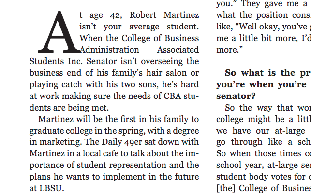
Picking up a copy of the Daily 49er is a struggle because of the design errors and lack of cohesive layout identity. This is why the Daily 49er’s design needs a makeover.
Throughout the newspapers I’ve collected, there are several examples of typographic mistakes, drop caps collide into the body copy often, orphans and widows, lone words or phrases are found at the beginning and end of text columns or pages, litter the Daily 49er.
Although some may see these critiques as nitpicky, having widows and orphans shows a lack of attention to detail and an overall carelessness when it comes to the visual communication of the Daily 49er. As a design student I’ve learned that graphic designers are taught that the body copy should match the work and that the phrasing of the piece can cause the readability of an article to decrease and the overall phrasing or meaning to change.
Other problems like rivers, which are large gaps in between words; registration errors, which means that pages are not lining up; and excessive hyphenation really give the Daily 49er a haphazard look. It would be acceptable if these design elements were tricky to fix, but they are some of the easiest mistakes to edit.
Moving body copy up on the page or expanding the margins can usually fix these problems quickly. Adobe InDesign even has settings that eliminate hyphenation and standardize layouts across multiple pages. The Daily 49er’s design problems are sloppy at the very least.
There should be more focus on the design of the paper, as it is the first thing people notice prior to reading. Words and phrases should be ordered in a way that complement the writing while also making it easy to read.
Visually communicating importance through text size and creating a clean look through alignment can amplify the aesthetic of a newspaper and its credibility. In some cases, sporadic storytelling in newspapers can be unified through a common design thread or element.
Without these fixes, the paper goes from professional to amateur in seconds.
Typography also creates a unified aesthetic. In the Daily 49er, for example, there is no identity. Different fonts are used interchangeably, layouts are not standardized and arrangements are splattered across the page without any care for alignment.
The Daily 49er is not the only publication that struggles with these issues. Other big name editorials, such as the New York Times, have similar problems when it comes to its column layout and should look to magazines for inspiration.
Magazines are often designed in a set style and have a cohesive look and treatment of body copy, headlines and advertisements. Dig Mag, for example, has done a fabulous job of paying close attention to how columns line up and how the layout of text reacts to the placement of photos and advertisements. They’ve designed their magazine with a common aesthetic and layout in mind.
Something that stands out to me when I read Dig Mag is that there are little to no widows, orphans or hyphens. This is probably because they have treated their body copy using flush left alignment rather than justified like the Daily 49er. Each page has the same layout when it comes to the running feet, or page number and header. Dig Mag is not perfect, but it really implements the correct design elements found in Vogue, Harper’s Bazaar and Elle magazine.
Newspapers like the Daily 49er can still improve its design by taking a look at magazine design structures. Creating a master layout in Adobe InDesign, setting a common typeface list and paying attention to detail can really elevate newspapers to the status of magazines and promote readability instead of quick production.
These critiques may seem harsh, but they are out of appreciation for typography, the style and appearance of printed media and newspapers all around. Hopefully the Daily 49er’s design team takes a look at industry design standards, or I might just have to pick up a copy of Dig Mag instead.


